Monday, September 25, 2017

texas is forever

i was really excited about this one shirt i bought so here's a post for it


during hurricane harvey, i found out that the ptvmerch site (merch site for pierce the veil- my favorite band) was selling a "texas is forever" shirt which made me wonder if it was bc of hurricane harvey or bc ptv has a song called "texas is forever" (it was both). the donations would go to help hurricane harvey efforts & you know, i'm in texas, tryna get some texas shirts & this one is from my favorite band so how cool is that??? plus it was only $18, compared to the usual $20+ of merch shirts, so i convinced myself to buy it- even when plus shipping made it out to be $21 ("it's for a good cause" i told myself)

it said it wouldn't ship until september 15 & by then hurricane harvey was over but i was still excited af to get it. when i finally did, i saw that it was a little big (as it always is w an unisex adult small) so today, when i finally decided to wear it, i had to tuck it in. even tho i hate tucking in my shirts, i gotta admit, some things just look 100% better when you tuck them

also i was excited bc this shirt is red & white which would match my (new-ish) red & white vans & bright red "saigon" matte lipstick perfectly

"saigon" red matte lipstick (colourpop)
"texas is forever" shirt (ptvmerch)
ripped skinny jeans (hollister)
red & white vans (vans)

Thursday, September 21, 2017

de stijl: van doesburg, piet zwart, de stijl magazine

key terms:
theo van doesburg: de stijl journal
piet mondrian
piet zwart
hendrik werkman: next call magazine

de stijl:
-"the style"
-a.k.a. neoplasticism
-1917
-wanted to restore order after WWI through art
-no ideology superimposed on it
-utopian & neutral
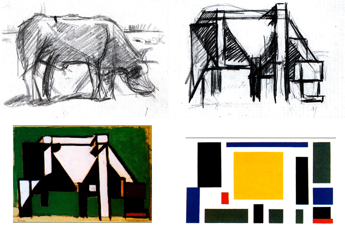
-underlying grid (suggested order & calm)
-moved away from nationalism which they thought started WWI
-"the old is connected with the individual; the new is connected with the universal"
-pure abstraction & universality by reduction to the essentials of form & color
-vertical, horizontal
-use black, white, & primary colors
-relationship between positive & negative elements in an arrangement of non-objective forms & lines
-simplicity, rectangular forms
-avoided symmetry & attained aesthetic balance by the use of opposition
netherlands = neutral during WWI
city: leiden
tableau 2- mondrian
absolute purity
order & harmony
restore order in aftermath of WWI
complete abstraction- eliminating references to nature
primary colors
theo van doesburg
took leadership role for de stijl

van doesburg pens a manifesto
van doesburg's evolution
path towards non-objetivity
process of simplification, abstraction, purification
van doesburg starts a journal: de stijl
circulates ideas widely through europe
typeface by van doesburg
mondrian
1920
piet zwart
realized modern aesthetic could be monetized
piet zwart created this typehead for jan wils
piet zwart's own personal logo
zwart means black
self-portrait- piet zwart
piet zwart kitchen design
modular
clean, seamless lines
reduced palette
zwart's work for NKF: dutch cable manufacturing company
see vitality of dada movement & russian constructivism
zwart
zwart
zwart
zwart
limited words
zwart
english version of NKF's catalog
hendrick werkman
werkman
compacting visual information even further
werkman
experimentation w typography
ink & rollers
pages from his journal: next call

werkman
commemorate death of lenin
cover of next call- werkman
bold, limited palette
purity & clarity
calendar- werkman
  • much of werkman's work was destroyed when he was arrested by nazis
doesburg & schwitters (dada-ist) collaboration
yelling
colors of de stijl, chaos of dada
combining both styles
dadaists, constructivists, de stijl-ists get together at constructivist congress
("let's reconstruct the world")
  • 1922: van doesburg is in germany to teach at the bauhaus
garrett rietveld
rietveld
tried to translate de stijl ideas into 3D

Tuesday, September 19, 2017

constructivism: el lissitzky, rodchenko, stenberg brothers, klutsis, stepanova

key terms:
russian revolution
vladimir mayakovsky: ROSTA window posters
vladimir tatlin
alexander rodchenko & varara stepanova
el lissitzky: PROUNS- projects for the establishment of a new art
photomontage
the stenberg brothers
  • russian revolution: 1917
vladimir lenin
vladimir lenin speaking to the crowd
bolshevik party coming together under lenin to overthrow the tsar
ROSTA (state news agency) window poster
stenciled
rudimentary efforts
printed by state telegraph agency
supported red army
silhouettes

"what you put in, you'll get out"

vladimir tatlin
was a sculptor but gave it up bc it was "selfish"
became industrial designer
rodchenko
gave up painting for graphic design & photojournalism
  • ^these leaders advanced core russian constructivism
-art was to serve a new communist society
-against art for art's sake 
el lissitzky
dissemination of ideas bc he went to school in germany
sees possibility for a new order/a new way forward
wanted to forge unity btwn art & technology
el lissitzky
pruons: new approach
1920
el lissitzky
el lissitzky
makes it 3D to try to engage more people
painting + architecture
transformed whole room into a proun
beat the whites w the red wedge- el lissitzky
1919
proun poster- communism vs. government/establishment
iconic work of russian constructivism
rejection of art for art's sake
photomontage poster for pelikan ink- el lissitzky
modern using experimental techniques
book cover for the "-isms of art"- el lissitzky
book cover for poet- el lissitzky
sans serif typography
rodchenko
photomontage
left front of the arts- rodchenko
journal covers
rodchenko
photomontage
bold typography
1928
constructivist photography:
jagged angles
contrasts
abstract uses of light

rodchenko
exploration of odd, aggressive angles
bird's' eye view
steps- rodchenko
stark contrast of black & white
rodchenko
diver- rodchenko
rodchenko
immediately readable
woman hollering about books
pacifier poster- rodchenko
klutsis
poster inciting proletariats to vote in election of soviets
dynamic angle of print
rodchenko w stepanova (wife & collaborator)
stepanova
stepanova made clothing to reach even more people
bold, impactful colors of constructivism
avant-garde
stenberg brothers created movie posters
members of avant-garde circles
founded society of like-minded young artists
would take scraps of other art to put in their posters to make it a collective work
stenberg brothers 
stenberg brothers 
stenberg brothers 
stenberg brothers 
reject fine art, embraced mass produced posters
stenberg brothers 
sporting poster- klutsis