katherine mccoy & cranbrook academy
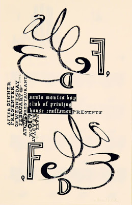
ed fella
david carson, raygun magazine
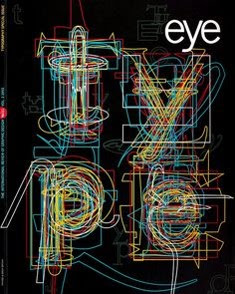
rick poyner, eye magazine
rudy vanderlans & zuzana licko, Émigré magazine
- just as bauhaus was being closed, cranbrook was being opened in the U.S. in the 1930s
 |
| cranbrook academy of art est. in michigan, 1930s |
-complexity
-contradiction
-experimentation/exploration
-embraces postmodern movement
-graphic design department for graduates only
-postmodernism should be considered on the same realm as pure modernism
katherine mccoy:
-co-chair of graphic design department w her husband michael mccoy
-worked for unimark (swiss style design firm)
 |
| poster for cranbrook graphic design program, 1988 overprinting layering not a clear, rational program photographic collage challenging text |
COMPARED TO:
 |
| swiss style clear, rational |
 |
| philadelphia college of art poster layered type different weights effort needed to read |
 |
| typography as discourse relationship btwn type & image |
ed fella:
-studies w mccoy
-embraces new theory, deconstructivist concepts
-progressive spirit
-revived handwritten typography
-his work is compared to futurist's words in freedom
-wanted to make it all more personal
-appealed to creativity & unfettered freedom
-rebellion against corporate style
-explores entropy, disintegrating forms from repeated copying, found typography, clip art, scribbles
-irregular letter forms & space
"deconstructing is a way of exposing the glue that holds together western culture"
 |
| expressive raw handwritten misshapen |
 |
| bringing back handwriting playful, exploration |
 |
| "american folk art" typography |
important graphic designers:
-steven heller
-michael beirut
-ellen lupton
-rick poyner
rick poyner:
-established eye magazine
-doesn't practice graphic design
-his writings have had a huge impact
 |
| reference to theo ballmer |
rudy vandderlans & zuzana licko:
-both immigrants, embraced american diversity
-licko embarks on digital typography (same year that macintosh comes out)
-start emigre journal (1984- 2005)
-credited as first to create digital fonts made on & for the computer
 |
| last issue of emigre bc expensive to produce quarterly |
 |
| licko's fonts |
david carson:
-founded raygun magazine (1992)
-practicing graphic designer
-moved to California; interested in surf culture
-largely self taught
-superimposition
-image & text
-accepted unpaid internship for action magazine
-went to switzerland to attend 3 week workshop of graphic design
-style: expressive deconstruction, especially in composition & legibility
-maximum expressive effects
-can also place his work in grunge movement: disheveled, the edge
-blurred photos, "dirty" type
-re-energized postmodernism
 |
| last issue of raygun |
- started own studio: carson design in new york city


No comments:
Post a Comment