 |
| die fahne hoch (raise high the flag)- frank stella 1959 |
-changes how you interact w it in space
-uncomfortable amount of space btwn painting & wall --> first steps of painting becoming an object
-depth pushes it from painting
donald judd:
-he doesn't make his own object, fabricators make it w his specifications
-based on own logic of construction
-designed minimalist furniture
-industrial materials
-more non-objective works bc nothing is representational; it is what it is
-big, american scale
-designed minimalist furniture
- judd coming out of abstract expressionist painting, what's he taking from it?
-industrial materials
-more non-objective works bc nothing is representational; it is what it is
-big, american scale
 |
| chose just one color & painted everything that color |
 |
| neither painting nor a sculpture extreme formal elements |
 |
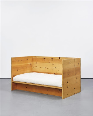
| day bed- donald judd furniture may look like sculpture & the sculpture might look like furniture to confuse the "line" |
 |
| clean & well integrated artwork in his living space (but he was a slob & there's no dresser) how does the minimalism of the room integrate w living? ignores the down & dirty |
- sculptures used to be on pedestals but judd takes that away & puts things flat on the ground or on the wall
- primary structures exhibit: marker in art history
 |
| primary structures exhibit dress |
 |
| robert morris |
- michael fried: if the idea is that the artist curates how the viewer sees/interacts w the work, then the artwork stops existing once viewer is not there; accuses minimalism of being theatrical
- minimalism isn't necessarily geometric shapes but it is industrial in nature, color is inherent, new materials, big, depends on/curates viewers
 |
| lever- carl andre bricks in a straight line coming out of the wall primary structures ties back to architecture creates a low boundary texture, color, logic of structure is inherent to material |
 |
| 12th copper corner- andre steel slats in the corner curates how you move through the space (whether you walk on it or walk around it) |
- when andre had his first international exhibit in london, the critics had a field day. they went to construction sites & compared his work w bricks there. the thing is that andre is still artful w his work. he puts it together in a certain way & they are all the same colors & purposeful
- avant-garde practice: making things that are invisible, visible; making things that are unknowable, knowable
- minimal work calls attention to the power of the exhibition space
Sol LeWitt:
- LeWitt's buildings cubes
-challenging to look at & understand; cool & detached
-thinking about logical conclusions & seriality, taking it as far as he can
- LeWitt's wall drawings
-instructions on how to create the wall drawings & the curator/whoever has it follows the instructions
-looks different every time
-dependent on the person putting it up
-removes himself from the construction
Dan Flavin:
-sees himself as painter making paintings out of light/industrial materials
-judd sees these as objects
-using architectural spaces (corners, hallways)
Anne Truitt:
-doesn't fit into minimalism, post-painterly abstraction, post-minimal painting
-refers to every she makes as a painting even if it's 3D
-someone would fabricate her works & she would gesso & sand them down & put layers of acrylic paint until she had exactly what she wanted
-colors aren't inherit to material like in minimalism, she chose the colors & added on top
 |
| allusion of representational |
- by putting her in minimalism, it recomplicates minimalism


These notes? All the awesome!!!
ReplyDelete