- modernism: mid 19th cent. up until 1950s-1960s
 |
The judgement of paris
Marcantonio Raimondi (after Raphael)
1510-20
paris- stole helen & instigated trojan war
paris sitting in judgement at left,
handing golden apple to whoever is the most beautiful in the world
(athena, hera, aphrodite) |
^parallel to edouard manet's luncheon in the grass; reinterpreting poses from judgement of paris
-extremely unacademic, acknowledging the flat surface
|
|
le dejeuner sur l'herbe (luncheon on the grass)- manet
1863
modernist medium specificity
deliberately problematic/unresolved
putting figures together of relations of non-relations
woman in back is too large for her position, closeness of hands
flatness to woman's flesh, blindingly white
brushstrokes not well integrated
sketchiness in landscape
shatters sense of separateness
weird bc naked woman isn't allegorical, just an every day woman
shown in the salon of the refused
sabotaged harmonizing values & clear unambiguous hierarchies
of classical renaissance order
|
 |
olympia- manet
1863
prostitute- outcast
stark flatness, blinding white highlighted by black outlines
lack of subtley
almost no chiascurro
flatness relates to print culture/illustration
cat at her feet instead of usual dog
flower in her hair = erotic
ribbon around her neck = presenting her body as a gift
african attendant = racist critiques
suggests she is a courtesan (escort, high class) -->
offensive to salon viewer; disguises class difference from clients,
pretending to be part of a higher class
unsubmissive & particular gaze |
-very direct stare, feels as if she is looking at you (individually); stiffer figure; intentionally flat
-used preordained, established themes & putting his own touches on them but still appears to be a stark break w tradition, highlighting the choices that he gets to make
-idiosyncratic approach
COMPARED TO:
 |
venus of urbino- titian
1538 |
-softer; different gaze; feels as if you are allowed to look
- Manet opens up a doorway for impressionist painting
Impressionism
-starting to focus on brushstrokes & mark-making; materiality
-breaking picture plane, acknowledging flatness
-en plein air
|
|
impression: sunrise- claude monet
1872, oil on canvas
en plein air, no preliminary sketch
short brushstrokes of pure color
smallness is emblematic of impressionist movement
absence of contour line & chiascurro
all light & darks given colors
apparent brushwork
no lines & delineation of perspective |
Post-Modernism
 |
mahana no atua (day of the gods)- gauguin
1894
bottom register colorful & abstract
tertiary colors
mysterious, allegory?
hidden narrative
arbitrary & symbolic colors |
 |
the large bathers- cezanne
1906
not well rendered, proportions are off, one plane
unfinished, a lot of bare canvas showing through
a lot of blue
nude women by body of water
trees form triangle, pyramid composition
framing tells you what to look at, move focus
figures are part of frame but there's not much being framed in middle
highlighting geometry inherent to the canvas = flatten canvas more
not much attempt at atmospheric perspective
blue of the water invades figures & goes into the sky
proto-cubist composition, shifting perspectives
makes you think about figure painting, where the figure isn't important
|
- Greenberg's take on modernism: each material reflecting its true essence; painting as most true/perfect artwork
 |
composition VII- kandinsky 1913
spiritual & musical interests to create non-objective, abstract art
pure line, pure color
attach symbolic meaning to colors & specific forms
borrows language of music |
categorizing color:
-local
-perceptual
-arbitrary
-symbolic
 |
composition w large red plane, yellow, black, grey, & blue- mondrian 1921
balance
prevents evocation of depth
reduced palette: primary & neutral colors
irregularly organized grid
equilibrium
lose sense of spacial recession |
-acknowledges what it is: flat, paint
Greenburg on avant-garde:
-first generation/point able to look backward & understand their place
-avant-garde coming from the rich, from the industrial, increase in education
-people/artists who recognize place in history & creating something that forces consideration & a different sort of viewing/literacy
-avant-garde: room for interpretation
-kitsch: trite reproduction, uncomplicated & unchallenging
Supremitism
 |
black square- kazimir malevich 1915
becomes cracked/faded
arrive at monochrome, most simple
0 degree of culture
purely man-made form
modern art is crafted image
formalist bent (greenberg)
intellectual rigor marries w aesthetic appreciation through essential forms
no pretense of illusionism
|
-modernism's belief in progress, universality --> anyone can see it & understand it
 |
0.10 exhibition in petrograd including kazimir malevich's black square 1915
historical context:
why is it hung in the upper corner?
(religous context) God said no representational images --> focus on geometry
debate in eastern orthodox religions about representational images
idea: not making a representation of something, it IS that something
ex. "that's not a painting of jesus, that IS jesus"
icons are hung in top corner in house |
 |
the fountain- duchamp 1917
"this is art bc i say it is so"
turned toilet on side, signed "r mutt"
seen as ugly, crude, lewd, lacked recognizable artistry
bc he didn't actually make the object himself
work HAD to be submitted but they hated it
submitted into exhibition that he's on the committee of
to test limits & power/taste of institution
|
 |
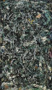
full fathom five- pollock, 1947
removed tool that separates him from the paint-
removed brush & puts paint on canvas, working from floor
the paint is just paint; referred to for materiality
anyone can understand it bc it is what it is
big step forward in avant-garde |
 |
lavender mist (number 1)- jackson pollock, 1950
1950, oil, enamel, aluminum paint on canvas
pure abstraction
emphasizes creative process
rhythmic drips, splatters, dribbles of paint
gestural abstraction
87x118- moving towards mural size scale, stand in front
can't really see the edges, can't consume it all at once
"all over" painting |
 |
chief- franz kline
oil on canvas, 1950
paint then projection- blow up smaller painting
a painting of a painting |
 |
black reflection- franz kline
1956
oil and pasted paper on paper
greenberg sees this as genuine & honest but the style being copied after as not |
 |
| july 4th- willem de kooning |
- Greenberg: sees manet as beginning
-this is how we got where we are
-it's not kitsch, can't be manipulated by tyrant
-avant garde painting makes us think & reaffirm ourselves as individuals
-flattening painting, acknowledging that it's paint on a canvas
SHIFT IN MODERNISM: focus on the relationship of the art to us as viewers
(made separately/diff locations but similar bc of flatness & references to figures, focus on picture/glass plane):
 |
the large bathers- cezanne
88x99 inches
1898-1905
not well rendered, proportions are off, one plane
unfinished, a lot of bare canvas showing through
a lot of blue
nude women by body of water
trees form triangle, pyramid composition
framing tells you what to look at, move focus
figures are part of frame but there's not much being framed in middle
highlighting geometry inherent to the canvas = flatten canvas more
not much attempt at atmospheric perspective
blue of the water invades figures & goes into the sky
proto-cubist composition, shifting perspectives
makes you think about figure painting, where the figure isn't important
|
 |
the bride stripped bare by her bachelors, even- duchamp 1915-1923
cracks on the way to an exhibition
oil, varnish lead wire and dust on two glass panes 109x69
he thinks of it as figure painting (bride, other people)
chocolate grinder (rounder object) = bachelors
bride at top
goes against removing references/content & has complicated objects representing references |
- has other work called bachelor grinds his own chocolate (masturbates)
 |
wedge of chastity- duchamp
1956/63, bronze & dental plastic
gift to wife when they got married, consumed by an individual only (wife)
evocative, dental plastic reminds you of the body |
- made other sexual objects called objects of desire
 |
etant donnes- duchamp 1946-1966
donated to museum, tucked in corner
doorway leading into a room, look through door
you're looking through the holes but other people are looking at you looking into the holes
becoming extremely aware of not only looking but of people looking at us looking
art = relationship of maker, object, viewer; this put to emphasis on the viewer |
WHAT YOU SEE ON OTHER SIDE OF DOOR:
 |
see a weird diorama w a nude body (cast figure), lantern, waterfall
cadaver(?), can't see a head, waterfall lets you know that things are moving in time |


No comments:
Post a Comment