
icon vs. logo
unimark
paul rand
chermayeff & geismar
raymond loewy
massimo & lela vignelli
- manner in which a corporation, firm or business presents themselves to the public, such as customers & investors as well as employees
- task of the corporate communications department to maintain & build this identity to accord with & facilitate business objectives
- visual manifestation of the company reality as conveyed through the organization name, logo, motto, products, services, buildings, stationery, uniform & all other tangible pieces of evidences created & communicated by an organization
requirements:
-unified aesthetic (naming, logo, color palette, font)
-flexibility across all platforms-consistency, familiarity in representation
-standardized layout
-reflective of business values
- society in flux --> companies recreate themselves/adapt


 |
| rod of aesclepius = medical aesclepius = deity associated w healing |


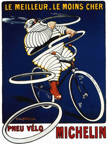
-guide for motorists
-michelin man became "mascot" for company
-encouraged people to travel so that they would need tires


"good design is good business" -thomas watson
- thomas watson hired j. gordon lippincott to do IBM's brand identity (before paul rand)
 |
| lippincott ethos |
 |
| giovanni pintori for olivetti |
 |
| pintori influenced by swiss style takes liberties w color |
logo: graphic representation or symbol of a company name, designed for easy recognition
icon: picture/image/representation
rebus: representation of a word through images
 |
| raymond loewy |


 |
| "S O" = standard oil |
 |
| loewy got the name to change to exxon |
 |
| loewy's creative process |
 |
| paul rand |
before:


rand:


- company logo distinguishes one product from another
 |
| chermayeff & geismar color tv came out so someone created the colorful peacock at some point |

 |
| most recent- stacked lettering, vertical & all caps kept kodak yellow & red |
 |
| studio 70 KFT (texas-based design firm) + studio 360 (radio firm) tried to design a new symbol to appropriately represent the south as it stands today |
 |
| bringing/stitching together society quilt concept- quilts are for homes idea of redefining "rebel" |


 |
| rosa parks as a "rebel" |
No comments:
Post a Comment