
key terms:
international typographic style/ swiss styleernst keller
max bill
theo ballmer
josef mueller- brockmann: grid systems in graphic design (1968) book
adrian frutiger: univers (1954)
helvetica, 1950s
armin hoffmann
neue graphik (design journal)
-emphasized an asymmetrical organization of elements of design
-organized all elements on a mathematically constructed grid
-sans-serif typefaces were mostly used
-orderly, objective clarity & order
-asymmetrical layout
-rejecting central axis
-flush left (left justified), ragged right
-photography > illustration
-good design --> good society
-reassuring


ernst keller:


- movement defined design as a socially useful & important activity
- critics complained that the style is based on a formula & the results are too similar to each other
- advocates argue that the formula allows for a perfection of style & results are only limited by the designer’s skills
- personal expression was rejected- problem solving was embraced
- designers were conduits for spreading information in society
_________________________________
- location: ZURICH, switzerland, 1950s
- swiss style came from constructivism, de stijl, bauhaus, & tschichold's new typography
- a.k.a. "grid system" style- underlying grid

 |
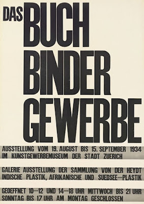
| swiss style poster 1950 asymmetrical layout built on grid unadorned approach to presenting content simple, clear sans serif typography |

 |
| asymmetrical organization on mathematically ordered grid photography text had to clearly & factually present information free from claims & propaganda |


-professor at zurich school of applied arts
-solution to design problem should emerge from content
-don't superimpose your ideas
-bold geometric form & text
-solution to design problem should emerge from content
-don't superimpose your ideas
-bold geometric form & text


theo ballmer:
-zurich school of applied arts- taught by keller

 |
| visible grid |


max bill:
-instrumental in disseminating swiss style
-zurich school of applied arts
-advocates pure modernism
-writes a manifesto for an art that easily connects w swiss style type & based on controlled mathematical construction- art was to have no meaning


 |
| manifesto |
 |
| type lines up at center but asymmetrical |
- WWII is underway- switzerland is still neutral
 |
| neue grafik (new graphic) design journal- 1959 most important journal about swiss international style |
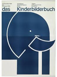
josef muller-brockmann:
-name is synonymous w swiss international design
-zurich school of applied arts
-opens own studio
-influenced by constructivism, de stijl, bauhaus, etc. but filtered them into distilled version of the style


 |
| tried to create method to show music in a mathematical way |
 |
| safety poster from swiss automobile club concerned about the growing number of vehicles & accidents |

 |
| brockmann's book (1968) structured layout, justifying words |

 |
| brockmann's book: the graphic artist & his design problems (1961) |


"the grid system is an aid, not a guarantee. it permits a number of possible uses & each designer can look for a solution appropriate to his personal style"
____________________________________
- BASEL, switzerland
basel school of design:
-another school like bauhaus & zurich's school of applied arts
-est. 1968
-center for disseminating swiss style
-modern architecture
-founders: emil ruder & armin hofmann
armin hofmann:


 |
| cleanliness readability photography presents info clearly & logically limited color range |
emil ruder:


"typography has one plain duty before it & that is to convey information in writing" -emil ruder
No comments:
Post a Comment